~
The subway is the life blood of NYC. Or should I say the veins. We flow through them powering the body of the United State’s most structurally impressive city. Regardless of any potential grievances you may have with your local transit system, it is invaluable to understand it. Lucky for us, New York has made available the subway’s (MTA) ridership data online. Hidden within this data is tens of millions of people, hundreds of millions of rides, and the heart of New York beats on and on.
In order to drive the investigation of the data, a hypothetical situation was created. The fabricated task is that of acting as consultancy for an imagined Non-profit that is putting on a gala. This gala would be free, and whom ever would give their emails would receive admittance. If this group were to want to market completely based on canvasing New York on the street, where should they be?
As with any questions involving data, the answers all depend on how deep you are willing to dig. Also we must narrow down exactly what question we want to answer. In order to identify this central goal, one must ask themselves what would be most helpful to our client. For this particular task, we must work under some assumptions:
- As a non-profit the group wants to limit the number people working on the street
- They want to maximize the success of the individuals that are currently working
- A way to understand how to automate scheduling would be valuable
As an end product, we can confidently say that we need to find when is best for there to be people on the street. Finally, can we create a useful tool to enable them to automatically create best schedules for their teams based on personal schedules? This may be the best final product, although it may be a bit of a reach with our current resources and time.
Cleaning The Data:
To achieve these first steps it may be wise to augment the data so that it can be analyzed on a per day, per week, and per month basis. With this we can see what are the best times to work in a day, what are the best days to work, and what months are slower or faster than others.
So lets see what we can do with the data! Looking at the columns, it looks fairly cryptic. What is a C/A? what is SCP number? Unit? Okay, station and time and line(1,2,3,a,b,c) makes sense. Exit and Entries are our targets for investigation.
Looking into the more cryptic are ids given to different aspects of the train station (the specific turnstile, the line, the train). Is any of this valuable to our goal? I am not sure it is. If there are street teams outside the subway, the specific turnstile may not be too helpful for their goal. Instead it may be more valuable to collect data on a per station level. Additionally, It appears to give us data on a 4 hour interval throughout each day. We’ll have to think about how to work with these constraints.
Before we investigate the data further, we must change it into a more suitable form. First we group the data by C/A, Unit, SCP, and Station, to capture all the Entries and Exits for each whole station. We also add together exits and entries. This is because if we are outside of the station, people who are walking into or out of the station are both viable targets. So we end up with a data set with traffic by station. We then see that the entries and exits are not raw values but are cumulative values. So we need to subtract each of the values by the prior 4 hour period in order to capture the data of the number of people to enter or exit for the current 4 hour interval.
This allows us to investigate a new problem. Some stations collect data on different times than others (some start at 12am, others 1am). So instead of allowing the data two be split into two groups, we can create a new time column where the time is grouped into the nearest interval. This means all data will be looked at as being collected on 4 hour bins from 12am upward.
We then are freed up to add columns for what day of the week it may be and what month it is. This will allow us to look into the data in a more detailed fashion than simply generalizing the data.
Analysis:
Now we can move forward with our analysis.
First we look at the generalized information. Here we have the charts for the ridership per 4-hour interval, per day, per month, as well as a chart for the total ridership of the top 20 stations. The bars for the total of hours represent the sum of the 4 hours prior to the label
|
|
|
|
|
|
|
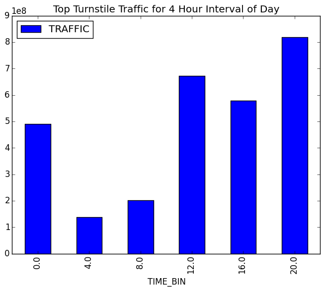
Here we can justify a lot of our current intuition. From 8am-12am and from 6pm-10pm have the highest ridership. This would be for going to and from work, respectively. The weekdays have the most ridership as there are many people coming in for their commute during the week. Spring through the end of summer has a slightly higher ridership then the winter months. Again this makes sense from a tourism perspective. The top 20 stations may appear obvious to some, but it is helpful in clarifying which stations are more viable when not considering just the top 10. Who knows that 125th is higher than canal? You may have a feeling it could be true, but we now have a more concrete picture.
what is especially helpful is where we can break down our analysis on a per station basis and identify where differences exist. For example it can be seen that Roosevelt Island Station has increased ridership during the weekends, despite the general trend. This is likely because of the interest in local tourism going toward the island, mixed with a relatively low population.
For the full documentation of the results read the pdf here
it contains dozens of graphs at each resolution (day, week, month, general).
Take-Away
From here we can see that to most efficiently aid in distributing a street team for marketing purposes, we can both use general trends and per station trends. If we were to create an app to aid in hiring/scheduling, it could take as input: the times available, days availabe, and list of desired stations. You could then use our data to derive a best set of stations for the individual, based on their criteria. With the per-month data you could throttle your hiring rates up or down based on ridership changes.
Regardless of one’s intent, investigating the push and pull of the lives that keep New York going is a valuable endevour. One that has the potential to transcend the numbers and reflect the values of the people of New York. Within every increase and decrease in traffic, there is a story. These numbers hold the secret to what keeps the people of New York going.
2016: Andre Gatorano